
Benchmarks: Valuations Chart Packet Published on October 8, 2025
- PDF for printing
- PNG for use in an e-mail or on a website
- EMF for use in Microsoft Office applications
- CSV for data used in the chart
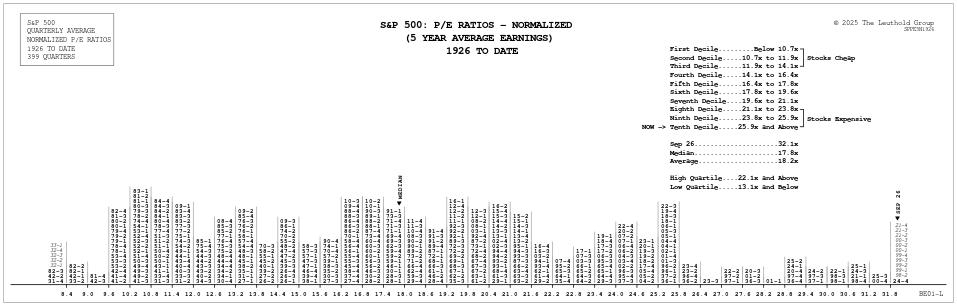
Leuthold Normalized PE ratio: based on 5-year arithmetically averaged annual earnings, looking 6 months ahead and 54 months back. This smooths out distortions from expansions/contractions for a more accurate idea of upside/downside risk.
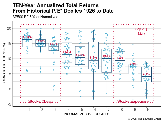
A test of the Leuthold Normalized P/E Ratio. The P/E's are deciled and 10-year forward performance is calculated from each data point and placed into the corresponding decile whisker plot.
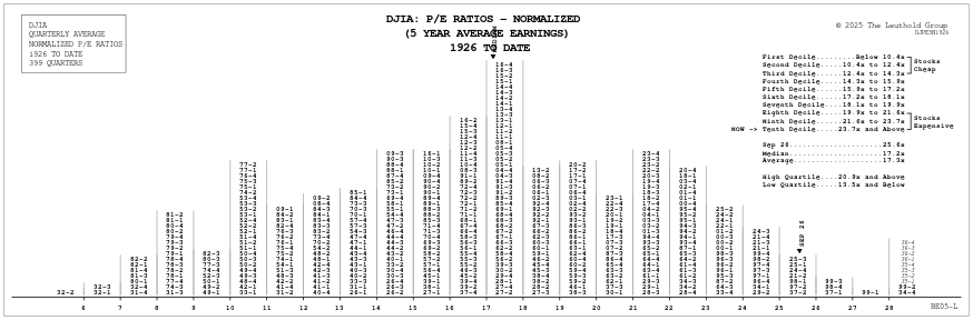
Normalizing: Earnings are far more cyclical than book value or dividends, so we think a smoothing technique is essential. Normalized earnings employed here are the five-year average of adjusted earnings. The normalizing technique employed has been consistent over the history of the study, so relative decile and percentile rankings are valid.
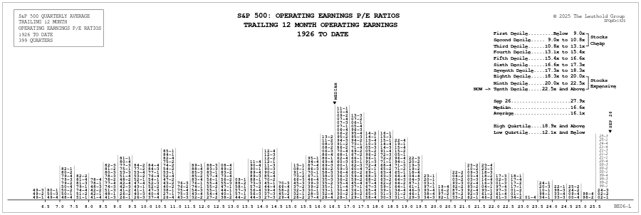
P/E ratios are calculated by using a straight operating earnings gure for year-end. Normalizing is not employed. In recent years, operating earnings have become a better gauge than reported earnings, due to the signi cant number of write-offs taken in the past. Operating earnings exclude the cumulative effect of accounting changes, special/extraordinary items, and results from discontinued operations. Prior to 1982, there was no signi cant di erence between operating earnings and reported earnings. The divergence was most significant in 2001, when operating earnings were 1.55 times greater than the reported earnings ($38.70 vs. $24.90). We prefer the normalized approach, but understand that P/E ratios are commonly presented on a trailing 12-month basis.
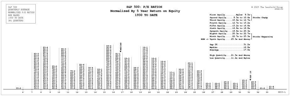
Normalization by using the 5-Year Return on Equity.
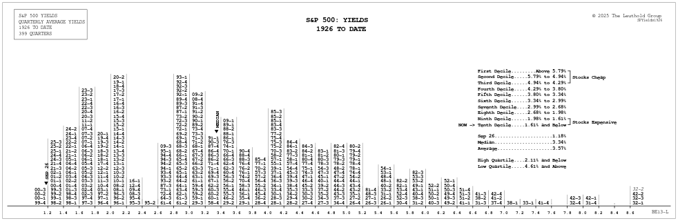
Dividends: Based on trailing 12-month dividend rate for the S&P 500 as reported in Barron’s. Outliers: High yields in the early 1930s are misleading and prevailed only momentarily, as dividends were cut sharply during the Depression.
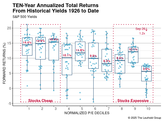
Overvalued Range: On the decile distributions, stocks are considered overvalued only in the ninth and tenth deciles. Stocks are viewed as cheap in the first three deciles.
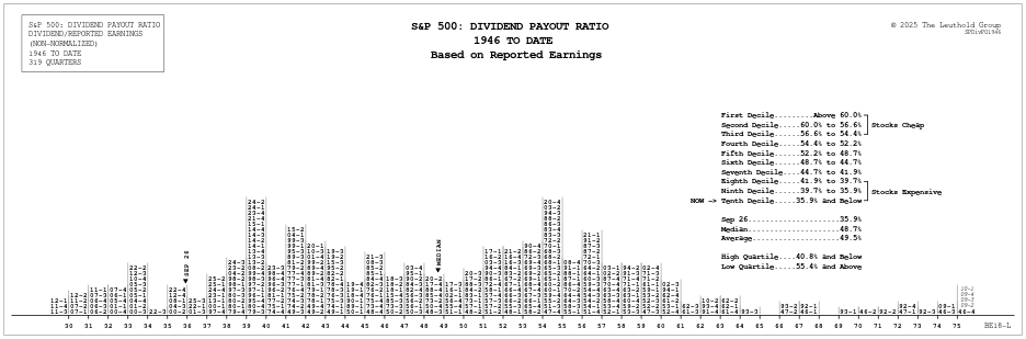
Dividends: Based on the trailing 12-month dividend rate for the S&P 500. Earnings: Based on the trailing 12-month reported earnings for the S&P 500. Outliers: High payout ratios in the early 1930s were misleading and prevailed only momentarily, as dividends were slower to be cut when earnings plunged during the Depression. This resulted in dividend payouts which exceeded earnings in several quarters. This is also what happened in 2009, and those postings should also be viewed as outliers. Because of the warp during the Depression, our histograms are presented only going back to 1946.
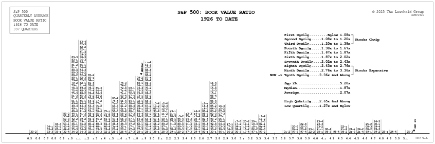
Calculations: Current book value is arrived at by factoring in six months of our future estimates combined with the prior six months’ book value. Note: In June 2003, Standard & Poor’s revised book value signi cantly higher. These revisions went back to 1992, and obviously had an impact on this histogram, since the Price/Book relationship came down considerably for the revised year. The revised book value numbers have been factored into these two histograms. Caveat: The U.S. economy has become increasingly service dominated, so book value relationships are less meaningful than in the past.
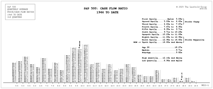
Calculations: Cash flow for the S&P 500 (earnings plus depreciation and amortization) is annual data. The measure takes cash flow for the prior six months and combines it with estimates for the next six months. Not Normalized: Since cash flow is not as volatile as earnings, it is not necessary to normalize cash flow when making historical comparisons. Limited Data: Compared with other measures, there is less historical cash flow data. S&P depreciation calculations use 1940 to date information. Prior to 1940, corporate tax rates were a maximum of 20%, with an average maximum rate of 11% from 1917-1937. With these comparatively low tax rates, the difference between earnings and cash flow was not very important.
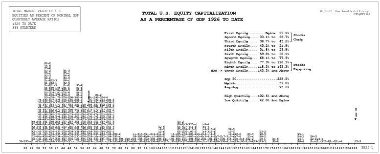
Total Equity Capitalization (historical): The historical data for U.S. stock market capitalization is annual data provided by Global Financial Data converted to quarterly data using the Ibbotson database. Total Equity Capitalization (current): We record current total U.S. market cap data from FactSet. ADRs, mutual funds, and ETFs are excluded.
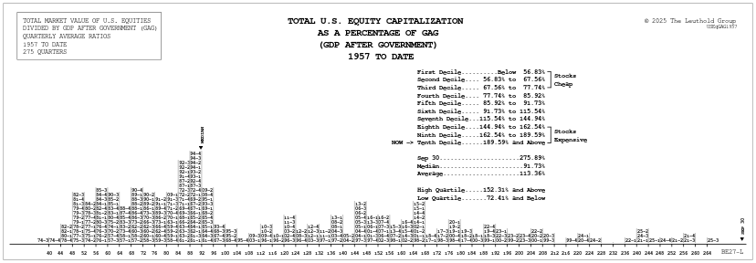
This measure of production excludes the impact of government expenditures. GDP combines private sector production with government output. Eliminating the government portion of GDP shifts the focus to the business sector. At times of increasing government expenditures, GDP is warped to the upside. Total Equity Capitalization (historical): Global Financial Data was the source of the U.S. market capitalization from 1926 to 2002. This data is only calculated annually; the quarterly total market cap is estimated using the Ibbotson Database. By monitoring the change in capitalization of their database, we can approximate the total market cap each quarter. Total Equity Capitalization (current): Current total U.S. market cap data is recorded from FactSet. ADRs, mutual funds, and ETFs are excluded.
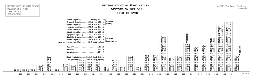
This histogram is another valuation comparison with the S&P 500. Here we determine how many S&P 500 Index units it takes to purchase a home based on the median sales price of existing U.S. homes. Median Existing Homes Price is monthly data compiled by the National Association of Realtors. In the histogram, the monthly data is converted to a quarterly average, and then compared to the average month end S&P 500 price during the quarter.
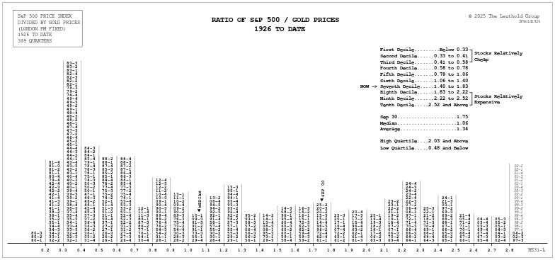
This histogram presents an alternative method to assess stock market valuation by calculating the number of ounces of gold it takes to buy one unit of the S&P 500 Index. Prior to the extremely high ratios in 1999-2000, this monitor was last overvalued for the stock market in the late 1960s. The 1967-1968 overvalued condition came after a relatively strong 20 year period in which the S&P 500 had advanced at about 15%+ per year including dividends. The most undervalued condition came in 1980, as gold was coming off its prior peak of $850/oz. Stocks at that time also proved to be very undervalued by more conventional measures like P/E ratios, dividend yields and book values.
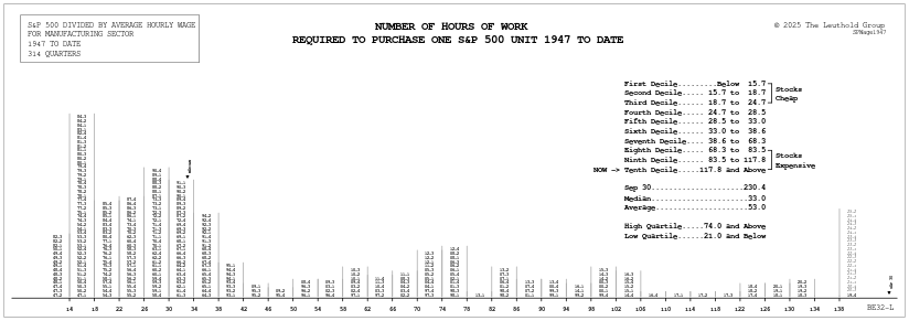
This histogram shows the number of hours of work required to purchase one unit of the S&P 500. While a steadily rising standard of living in the United States has enabled American workers to enjoy an increased level of purchasing power, rapidly rising equity valuations have resulted in a significant decrease in stock market purchasing power over this 1947-to-date time frame. Average Hourly Wage is monthly data compiled by the Bureau of Labor Statistics. In the histogram above, the monthly data is converted to a quarterly average, and then compared to the average month-end S&P 500 price during the quarter.
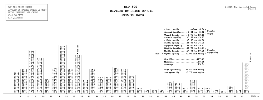
Measured by the number of barrels of oil it takes to purchase one unit of the S&P 500 index. Barrel Price is monthly data compiled by the Department of Energy, and is based on one barrel of West Texas Intermediate Crude. From 1945-to-present, the price